Launching the New IgnitionDeck Website
DigiSavvy recently launched a new website for IgnitionDeck, the longest-running, White-Label, Crowdfunding plugin for WordPress. High-fives were given, celebratory drinks were had, and a new website was launched.
Before I get started on this, I’m one of the partners behind IgnitionDeck. So with that out of the way, let’s dive in!
IgnitionDeck has been around since 2010! That’s a long time in internet years!! Nevertheless, thousands of customers and businesses rely on IgnitionDeck for their fundraising campaigns and crowdfunding-business needs.
This project was not straightforward and required a lot of discovery and planning. This is the story of all that planning, discovery, and implementation.
A little TLC
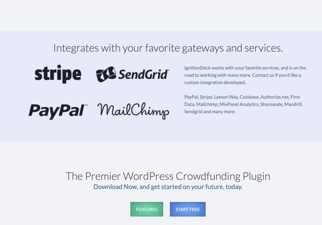
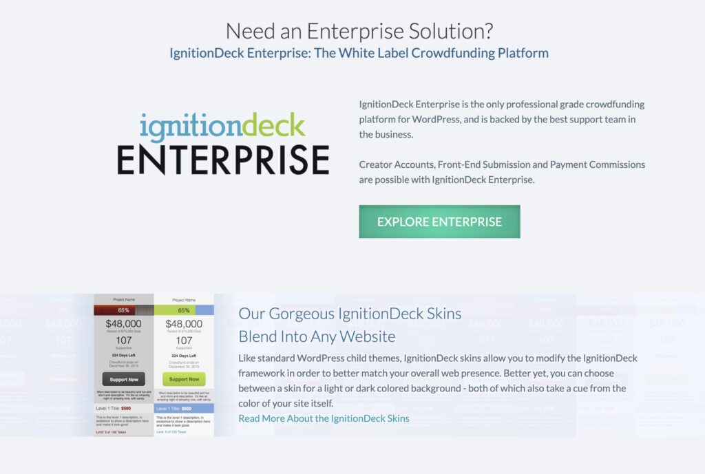
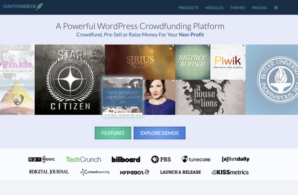
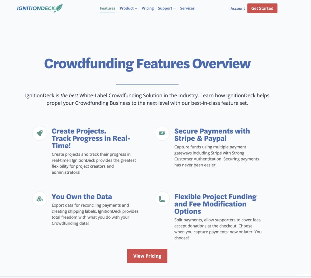
a few screenshots from the old website…
IgnitionDeck was long overdue for a website redesign. The website worked just fine, but it was dated, like your parent’s friend who is still rocking that feathered hair look from the 1970s in 2022. Twenty Ten called and wanted their damn visuals back!
There were a lot of technical hurdles we had to overcome within the plugin itself before we could turn our attention to redesigning the website and make it over with a new bucket of paint.
Decoupling the Plugin from the Website
My partners and I purchased IgnitionDeck at the end of 2018. Yes, folks, we were ahead of the curve on Acquisition-Press. And in case you were wondering, no. We received zero prizes for being early. So, when we dug into the plugin, we discovered a lot about how the plugin worked.
We didn’t realize at first that the plugin was connected directly to the marketing website, meaning there were dependencies within the plugin that depended on specific assets being present on the website! That was odd, but given the age of the codebase, development standards were different, and there remain many ways to build a web thing.
What was clear from our discovery was that we couldn’t just make idle changes to our website without introducing potentially breaking changes. So we had to proceed with caution.
Custom Coded Templates
Another thing we found out after we took over the IgnitionDeck website was how dependent it was on hard-coded page templates. These templates could only have their content modified via code changes and not through the editor. So again, we had to tread carefully, but managing a site like that would introduce more issues and add unnecessary overhead to simple marketing tasks.
Updating hard-coded marketing pages was a PITA, so we didn’t often update the theme. The theme also didn’t provide a lot of flexibility to create built-in page layouts, and the block editor broke the site layout completely, so we had to use the Classic Editor. This was by no fault of the previous owner, certain things were possible in 2010-2011 with WordPress, and there were specific ways people approached theme development—things have changed so much since then and even just within the last year!
In short, we were like, screw it. We’ll wait until we can focus specifically on the build-out of a new website and prioritize plugin development.
Moving forward…
The previous owner had a particular approach to their product and website—we knew that if we wanted to move forward, we’d have to decouple the website from the plugin, which would require heavy engineering on our end. So we opted to put our time and effort into better understanding the IgnitionDeck (ID) platform to put a plan together for how to introduce changes that would allow us the freedom to build and market ID the way we envisioned.
Project approach
The first thing we needed to do was understand the IgnitionDeck features and overall plugin ecosystem. We needed to understand this to know how the website and plugins were interconnected.
The plan
- Decouple IgnitionDeck licensing from website dependencies
- Integrate Easy Digital Downloads into IgnitionDeck
- Import existing customers into EDD
- Build simple onboarding process for existing ID customers.
- Test it
- Ship it
- Start working on the new website.
Decoupling plugin from the website
Once we had an idea of the plugin ecosystem, we could make a plan and punch list of tasks that would help us get to where we wanted to get to. Those tasks included modifying the licensing functionality to no longer be domain-dependent. The licensing system was sound, but it ultimately didn’t do a good job notifying people when their licenses needed to be renewed and was dependent on code specific to the website’s server hosting setup. Our answer was to replace the licensing module with Easy Digital Download’s software licensing capabilities. We have so far been impressed with EDD’s licensing; we see license expiration notices go out now, and it’s making a positive impact on our business.
Once we were able to clear some of our other technical hurdles, such as how to integrate EDD into IgnitionDeck, we had to figure out the best way to migrate existing customers into the new system, help onboard them, and have a contingency for those folks who were customers but did not get imported for whatever reason.
Build it while we’re building it…
While there was a ton of plugin development happening, I started designing and building out the new IgnitionDeck website. I built something leaner more visually pleasing, all while the critical work of plugin/website decoupling was happening.
The separation of concerns
One of the things we discussed internally was the separation of concerns. In my experience building websites, no good comes from having a website that does many things at once, which means that I’ve formed the opinion that a website ought to be a purpose-built application. If it’s a membership website, build it as a membership website. If it’s a custom application with specific functionality, build the site to do that, don’t also make it a marketing website. Don’t throw everything in a blender and hope for a highly detailed sculpture when you pour out all the contents.
Keep in mind this wildly hot take is based purely on my own experiences. Do I think I’m 100% right about this? Not really. It depends on the use case.
The more code you add to a codebase, the more brittle it becomes, no matter how solid your dev/testing/deployment practices are. It is this line of thinking that I decided to separate the marketing website from the plugin/software licensing and member account management functionality. So this new website project because two websites, technically. Ignition.com and members.ignitiondeck.com
I decided that the new website would use the block editor rather than a visual builder like Elementor, Beaver Builder, and Oxygen Builder. Mind you, I think each of those builders I mentioned is better than the block editor, and it’s not even close. The block editor is still solid and improves monthly, but I feel it’s not even ready for production; I believe it’s still in beta, with some pure experiments features.
Regardless, I felt it was essential to embrace WP’s direction, and at that point, I’d used the Block Editor for many of our projects in the past couple of years.
The Good and Not-so-Good
Picking a starting point for the new website
A lot has changed with WordPress theming; specifically, Gutenberg (the block editor) has changed things drastically with how we build things. And the block editor itself continues to rapidly iterate—one reason why I’m super grateful for the plugins and themes that have embraced the block editor, like Kadence Blocks and Themes. I’m also super thankful for Advanced Custom Fields Blocks (ACF Blocks), which have been huge these last couple of years since WordPress 5.0 hit.
What about using a theme that leverages Full Site Editing (FSE)? After reading Justin Sainton’s experience with it, it was that’s a no from me, dawg response.
I wanted a solid block-forward theme, something that was built to make the most of the block editor. I knew about Astra, Qubely, and Kadence, so I evaluated both.
The bad
I found Qubely, personally, frustrating to use, and there were odd choices they made with the visual editor options for a number of their blocks. Case in point, when clicking on any Qubely block, the first thing that you would see was a panel for ‘layout suggestions, which you couldn’t disable or remove, although I submitted a request to have that be an option you could disable. But the choice was mind-boggling as it was a source of frustration having to click off those suggestions to get to the block settings. I’m white-knuckling just thinking about it.
Further, I noticed many quirks in tablet and mobile layouts that require special CSS to correct—all the themes at that time did not seem ready for prime time. I’m sure; however, that’s changed in the year since I last worked with it.
The good
Enter Kadence Theme. Kadence’s theme was relatively new on the scene, but I was eager to try something explicitly built for Kadence Blocks, which we’ve been using since they were released. We’ve used Kadence blocks on some of our most important projects—thus, the Kadence team has earned my trust with a great, constantly iterating product that has proven to me to be battle-tested. Also, their support is superb.
Recreating my Qubely layouts in Kadence was a snap; there were no odd options panels obscuring me from doing what I needed to do. As someone who developed themes for years, the implementation of Kadence Theme made sense to me—especially their implementation of the Kadence Elements feature, which lets you add content to various hooks output throughout the theme (or other custom hooks).
After some weeks, we were able to put together a design in-browser and further develop the aesthetic and features of the website.
Our team has built many of our recent projects using Kadence Theme. BAOS, the Urban Dater, Ability Central, and IgnitionDeck. Oh, oh! And the current (as of 2022) DigiSavvy website! We love it.
The odd
Because we decided to host the e-commerce and member account capabilities on a separate website instance, a conversation around where to place our product pages emerged. After some discussion, we decided the product pages and any marketing-related content would remain on the marketing site (genius, I know). So, in EDD, we redirected all product pages back to the marketing site and set up canonical URLs to inform search engines where the original product pages resided and then used direct purchase links on our product pages to the appropriate purchase point.
The DevOps of it all
We wanted to ensure that updating the website would be a seamless process and by leveraging the block editor, we’ve achieved that. We can build-out whatever layouts we want. Quickly and without affecting site functionality. What a novel idea!
We wanted our code to live where our issue tracking and plugin development happens. Thus, our codebase for the site is hosted on Github. The website itself is hosted with our partners at Pantheon (I can’t recommend them highly enough).
We’re able to deploy our GitHub changes directly to our Pantheon repos. You can read up on that here.
Designing it
Add less more
Andrea Lenardin Madden AIA
A former client of ours has a saying add less more. And it resonated with me. It reminds me of the quote that says a design is done not when there’s more to add; it’s done when there’s nothing left to take away. Andrea’s quote is perfect, in my mind. A copywriter couldn’t have written it any better.
I’ll be the first one to tell you that I’m not sure the new design is necessarily better. Still, it focuses on the necessary—I focused on what was important for the prospective customer to do and what they needed to know about IgnitionDeck.
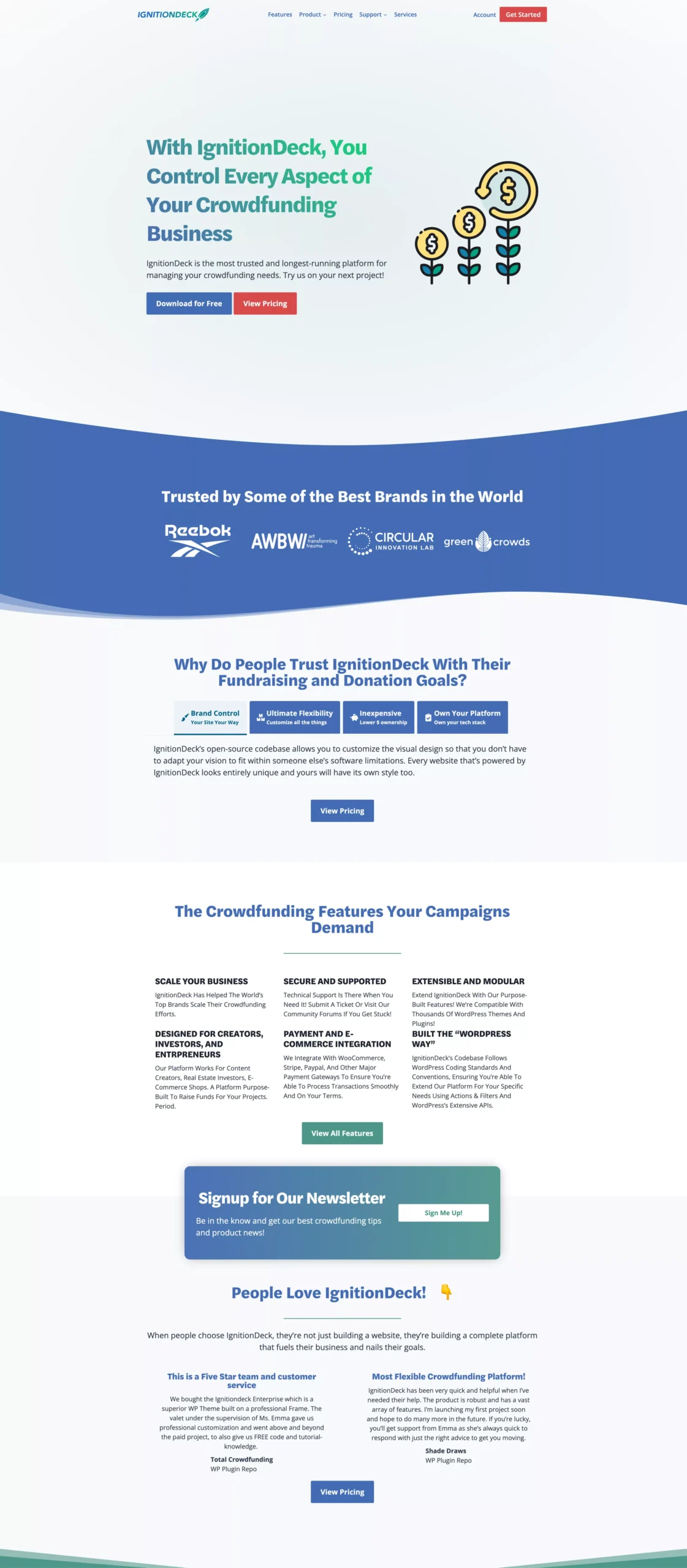
What I feel the new design does is that it simplifies the journey and simplifies the content to its essential components. We make it clear what we want you, the customer, to do once you hit our site. Download or buy. That’s it if you’re going to sign up for our newsletter, great!
Add less more.
Before / After
Click and drag left or right to see the before and after for the IgnitionDeck website.
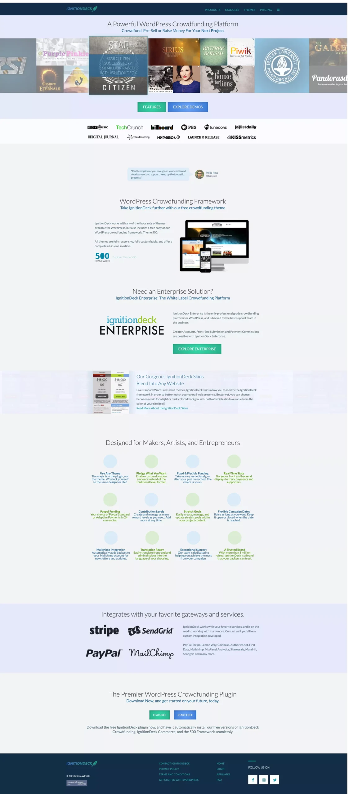


And if you are looking into a free alternative to GoFundMe, Kickstarter, or Patreon, then by all means, please head on over to the new website.
Get Notified When We Publish New Content!
Join more than 2,500 people who get our marketing automation, business marketing, and WordPress news!
