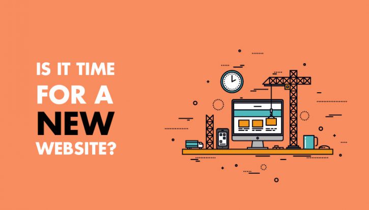
3 Signs You Might Be Ready for Website Re-design
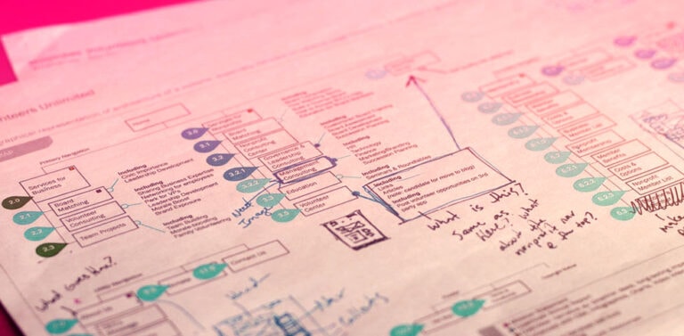
As some of you may know, we recently rebuilt/redesigned our site. It took us four years to get the thing done. A classic case of the “Cobbler’s kids needing shoes.” We have needed a redesign for a while; I keep saying as much.
Our old site was designed in 2016, and it looked like it. It was par for the course of other such agency-like sites of the time. However, it didn’t stand out and didn’t have personality; I knew that something needed to change.
I could go into my journey of how and why, but I think it’s better to condense things.
How do you know you’re ready for a change?
Knowing it in your gut.
I knew that our old site didn’t represent what we could do with custom development; it didn’t represent my knowledge or expertise; it didn’t represent all the cool things we could do. So, how do you make a site that represents what you do and what you’re good at?
Your site “looks” dated… Design trends come and go, and they do so quickly. As a result, sites can look pretty suspect without too much time passing. If your site uses design elements that look dated and don’t stand the test of time, it might be time for a change. Ask your designer friends to have a look; ask your folks to take a look.
Ask folks who don’t know much about design to have a look and heed their input. The untrained eye can carry literally tons of great information. For example, I used to have another business with the unfortunate name “Concentric Concepts.” I had my aunt take a look, and she asked me, “You’re in the Contraceptives business?” Embarrassing!
Your site no longer represents you or your business…
There are no simple answers, but I can tell you that a website should highlight your knowledge and sense of style in some way or another. If you’re working with a designer, defer to their guidance, but be aware of what you like and don’t like. For DigiSavvy, I didn’t want it to look like the typical “Agency Website.” It needed to stand apart from the pack; it was vital that it was colorful and had personality.
Changes were made to our website, and we updated the color palette, the layout, and the copy. The website represents us! It’s still not perfect, but it better represents who we are as professionals.
From copy to calls-to-action, the site isn’t perfect, but it’s perfectly us.
Your site’s functionality is limited or is hard to update…
I recall seeing one phrase from Bill Erickson, who wrote: “Your website should be easy to use and hard to break.”
I. Love. That!
We live in a day and age where anyone can have a site and put it together without much to do with coding. You can host on Wix, Squarespace, or several other providers and build something. You can do this with Drupal or WordPress also. The point is that the Average Jane (or Joe) can do this today, right now. Everyone should feel empowered to make the changes they wish on their website, and gosh golly, everyone should!
If your site is inflexible and incapable of supporting your initiatives, then it’s time for a change. Here, we recommend WordPress. But I’ve also worked with clients using other solutions that do the trick. It just matters how flexible the answer is and how easy it is to use.
The overarching point I’m trying to get you to think about is why you feel you need a redesign. It shouldn’t be a “just because I wanna” impulse. It should serve a real goal or represent a change that aligns with your own business. That is, if you’re a big business, high-end type of provider, your site should also reflect that. It should represent your ideals, your sense of fashion, and your taste in all. It should represent YOU.
Image Courtesy of: http://www.scifiscoop.com/
Get Notified When We Publish New Content!
Join more than 2,500 people who get our marketing automation, business marketing, and WordPress news!