How I designed DigiSavvy’s Refresh for Etch Using Claude

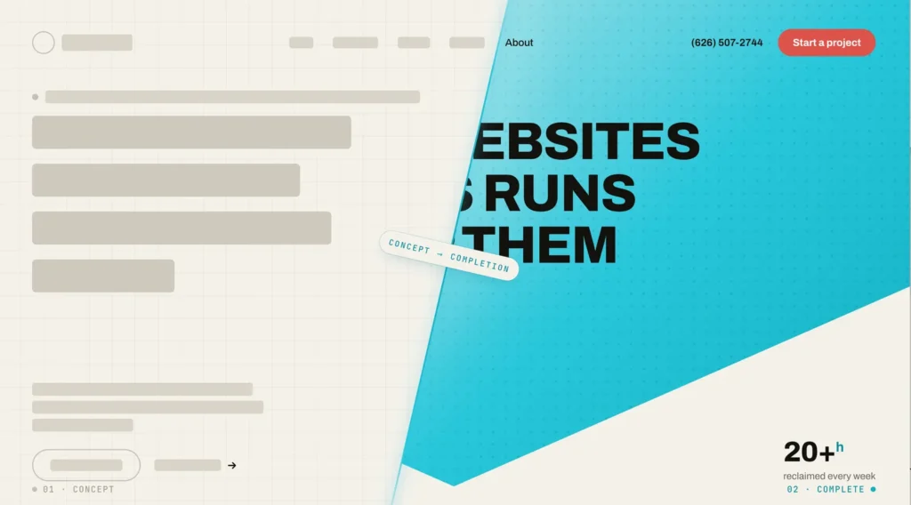
I’ll be honest with you: the first batch of designs for the new DigiSavvy was garbage. Not “needs a little polish” garbage — actual, throw-it-all-out, what-was-I-thinking garbage. So before I tell you how the relaunch design actually came together, let me tell you how it didn’t.
Four concepts, zero keepers
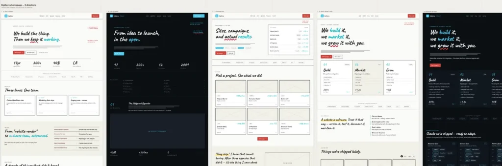
I started where a lot of people start: I sat down with Claude, described what I wanted in plain English, and asked for some directions. It gave me four concepts. I looked at all four and felt… nothing. Not one of them made me want to keep going. They were fine. Fine is the enemy.
That’s not a knock on the tool, by the way — it’s a knock on me. I’d asked for “a website,” and I got websites. The problem is I didn’t actually know what I wanted yet, and you can’t describe your way to taste. You have to see stuff and react to it.
But I’m not a designer…
I’ve never considered myself a designer. I’ve never been hired to design anything. I’ve been a person who builds designs, but also, you know, I have opinions, I have an eye for things. But does that make me a designer? I think at this point, what I’ve come to conclude is that to be a designer, you simply have to be a person with a very peculiar set of opinions, and that alone, I think, makes you a designer. Now, that is oversimplification, I realize, but in order to get out of my own way, I had to accept that, hey, I have specific opinions, I have taste, it’s useful, let’s lean into it…
What’s a wild design opinion that I have? Bold. Big and bold is beautiful. Chonky headers do that. Keep it interesting and don’t overdo it. Another opinion? Your primary CTA button should never match any other color on your page, and it should be an eyesore.
Also, I’m full of shit. I’ve designed things here and there.
So I did the thing I should’ve done first
I opened Claude Code, where I’ve got a few front-end design skills loaded, and described what I wanted again. But this time, I brought some examples of existing sites that I liked. I also linked up the Mobbin MCP for more design inspiration across different sections and styles I liked, and took a little more time, sharing some assets with the tool to provide direction for what I wanted. Do you want to know how that went?B Totally different result — this time the output wasn’t talk, it was four actual HTML mockups I could open in a browser and poke at with my own hands.
One of them was good. Not done, not perfect — but good enough to carry forward. And that’s the whole damn game, folks. You’re not looking for “finished” on the first pass. You’re looking for one thing with enough of a spark to keep pulling on the thread.
Now we’re cooking — fonts, color, copy, imagery
With a concept I actually liked, I moved into the fun phase: asking for different fonts, different color schemes, finessing the copy, and figuring out what the imagery wanted to be. After a few more rounds, I had something much closer to what I had in mind.
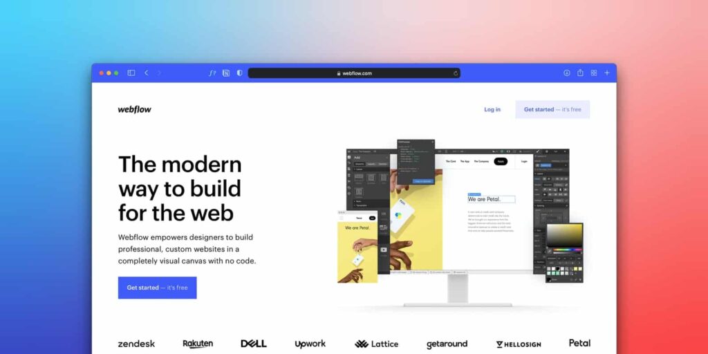
Below are a couple of concepts that were close to what I wanted, so I leaned in and go to work.
Make it bold…
I’m a big fan of things that are big, so I knew that the header or the main title heading on each page was gonna be fucking huge, and I think that level of boldness adds something to a design. Too often, things aren’t big enough, they’re not bold enough. I’m not saying this design is the best thing ever produced. It’s far from it. But it spoke visually in the way I would like to speak to people. I want to speak to people confidently, so the font I needed had to be bold and big, and I settled on Clash Display.
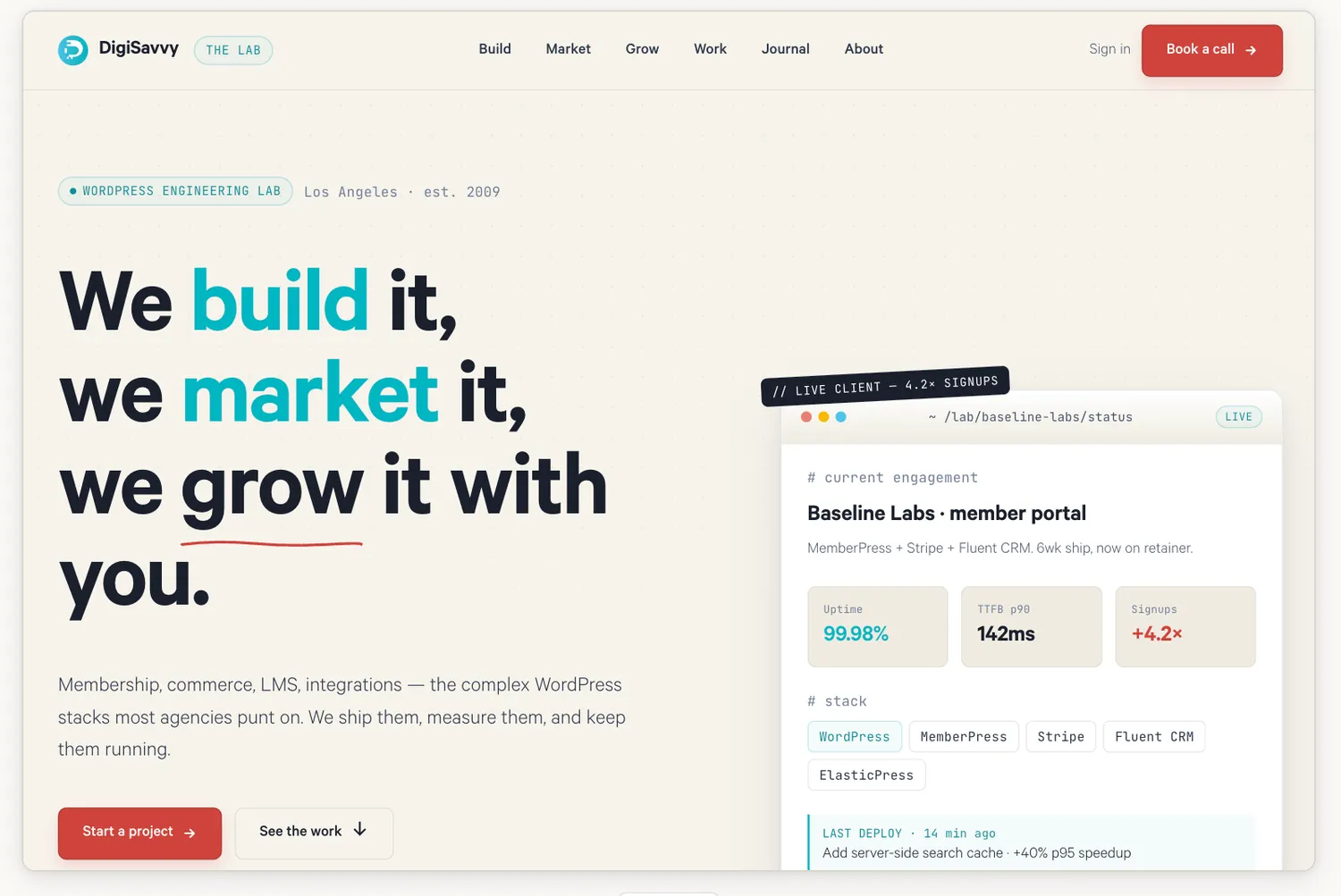
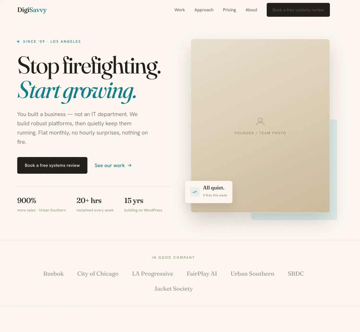
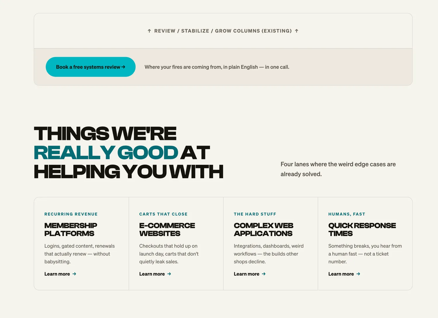
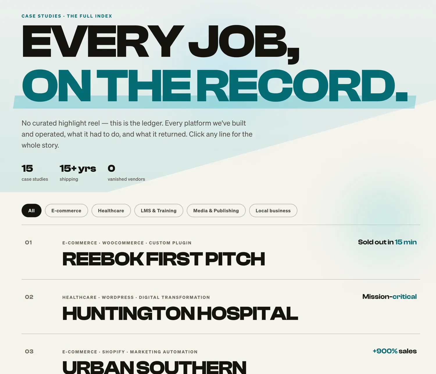
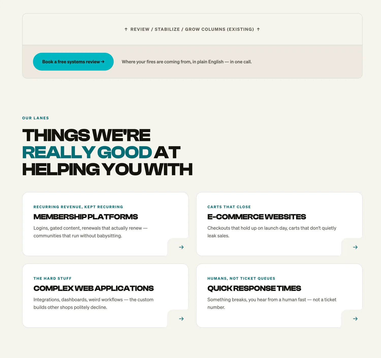
This is where it stopped being “generate me a design” and started being a conversation. Make the headings huge — no, huge. Bigger than that. Try this typeface. Now that one. Ugh, no, the first one. What about this for the body? I landed on Söhne for the body text because it just looked really nice against the rest of the aesthetic — clean without being cold.
I kept telling it I wanted something brutal and Swiss. Big type, hard structure, lots of confidence. I honestly don’t know that what came out is either of those things, exactly — but I’m really happy with where it landed, and that matters more than whether it fits a label.
Shaping it — keep, trim, add opinion
Once I had chosen the direction, the real work started: shaping it. Trimming out the stuff I didn’t want, then adding back more of what I did want. Every pass got a little more opinionated. That’s the part you can’t skip and can’t rush — it’s just you, the design, and a thousand tiny “more of this, less of that” decisions.
The era of beige…
If you pay attention to design trends then you probably nailed the bit about this site being beige. Make it look like the Anthropic website!! Sigh.
You’re not wrong. This site is shamefully warm grey, off-white, BEIGE AF. Yeah, just looking at the Anthropic site, I throw my hands up. The color scheme is pretty much the same. I hate myself when I think about it.
It is what it is, and I’ll likely stick to it for a decade. Kidding, of course. One of the net-positive benefits of having a design in a proper tokenized design system is that I can make changes sitewide quickly and see how things look. If I wanted to go white, I could do it, harkening back to previous DigiSavvy designs. I could lean in on blue hues, again, easy to do.
I’ll probably just sit on this for a while — I’m aware of how much of a biter I am, so take it easy on me.
The unlock: a design system
Somewhere in there, the homepage stopped being “a design” and became a system. Automatic CSS did a lot of heavy lifting here — it gave me a real framework of tokens for spacing, type, and color, so everything stayed consistent instead of me eyeballing pixel values forever.
I also added some custom tokens where I felt ACSS didn’t quite fit. Am I sure that was the right call? Honestly, no. I did it for the homepage at least, and it’s worked out, but it’s the kind of decision I might second-guess later. I’m telling you that on purpose — design isn’t a series of obviously-correct moves, it’s a bunch of judgment calls you make and live with.
But here’s the payoff: once you have a system in place, building new pages gets so much faster. For every new layout, I’d go back into Claude Code, walk through the design aesthetic and the system we’d already built, and ask for a few versions of the page. When I saw something I liked, we’d convert it into an Etch-compatible layout using the ACSS tokens. (If you want the technical side of that — the Etch and Claude workflow — I wrote about it in Building With Etch.)
The rule of thumb, if there is one
If I had to boil the whole process down to one thing, it’s this: draft a bunch of concepts, then iterate on the ones you actually like. Don’t fall in love with the first thing, and don’t expect the first thing to be good — mine sure wasn’t. Combine things, a big shitty bowl of seafood stew, if you will.
A lot of what I did was to take a section I liked from one concept, another I liked from another, and pull them into a single “final” candidate, then iterate on that. Frankenstein it together from your favorite parts, then keep refining the monster until it stops looking like a monster.
It takes work. It takes time to pare it all down and figure out what you actually want versus what just looked neat for a second. But that — the patience to create many options and then ruthlessly cut — is what’s helped me most. The AI makes drafting cheap. The taste is still yours to bring.
That’s the new DigiSavvy. I’m proud of it — garbage first drafts and all.